Load Package
import numpy as np
import matplotlib.pyplot as plt

%matplotlib inline
Basic Attributes
alpha : 투명도
kind : 그래프 종류 'line', 'bar', 'barh', 'kde'
logy : Y축에 대해 Log scaling
use_index : 객체의 색인을 눈금 이름으로 사용할지 여부
rot : 눈금 이름 돌리기 (rotating) 0 ~ 360
xticks, yticks : x, y축으로 사용할 값
xlim, ylim : X, Y축의 한계
grid : 축의 그리드를 표현할지 여부
subplots : 각 column에 독립된 subplot 그리기
sharex, sharey : subplots=True 이면 같은 X,Y축을 공유하고 눈금과 한계를 연결
figsize : 생성될 그래프의 크기를 tuple로 지정
title : 그래프의 제목 지정
legend : subplot의 범례 지정
sort_columns : column을 알파벳 순서로 그린다.
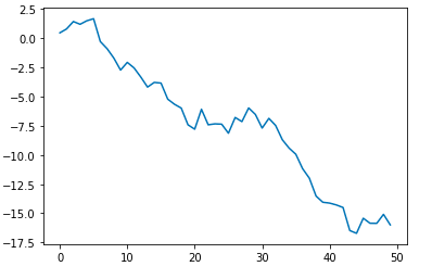
data = np.random.randn(50).cumsum()
data

>>
array([  0.4561948 ,   0.79173183,   1.42355353,   1.18809693,
         1.48858039,   1.66422703,  -0.2929166 ,  -0.89775044,
        -1.70598975,  -2.73494967,  -2.07468715,  -2.54879922,
        -3.32803995,  -4.19037889,  -3.79111845,  -3.84763245,
        -5.22390815,  -5.663442  ,  -5.98871358,  -7.42170563,
        -7.79773906,  -6.09163947,  -7.421305  ,  -7.33967375,
        -7.36688864,  -8.14437668,  -6.79224023,  -7.14845629,
        -5.97809649,  -6.53465732,  -7.70213177,  -6.87039508,
        -7.47855009,  -8.70549507,  -9.41818181,  -9.94608223,
       -11.17780456, -11.99021362, -13.52719088, -14.05499377,
       -14.12633198, -14.28373501, -14.50433153, -16.47662814,
       -16.71542268, -15.42504843, -15.85377005, -15.86050729,
       -15.09177336, -15.99095072])
그래프 그리기
plt.plot(data)
plt.show()
여러 그래프 그릴 준비하기
plt.subplot(1,2,1) # 빈 subplot 만들기
plt.subplot(1,2,2)
plt.show()
Multi graph 그리기
hist_data = np.random.randn(100)
scat_data = np.arange(30)


plt.subplot(2,2,1)
plt.plot(data) # subplot에 plot을 넣는다.

# subplot에 histogram을 넣는다.
plt.subplot(2,2,2)
plt.hist(hist_data, bins=20)

# subplot에 scatter을 넣는다.
plt.subplot(2,2,3)
plt.scatter(scat_data, np.arange(30)+3)
plt.show()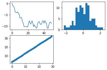
그래프 선 옵션
- 그래프를 그릴 때 표시 되는 색이나 마커 패턴을 바꾸는 것 확인
- 색상: b(파란색), g(초록색), r(빨간색), c(청록색), y(노란색), k(검은색), w(흰색)
- 마커: o(원), v(역삼각형), ^(삼각형), s(네모), +(플러스), .(점)
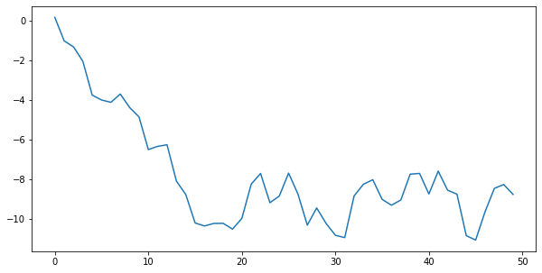
plt.plot(data, 'g+')
plt.show()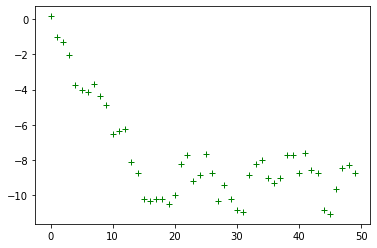
plt.plot(data, 'k^')
plt.show()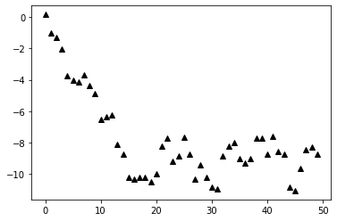
그래프 사이즈 조절
- plt.figure 안에 figsize를 이용하여 가로, 세로 길이 조절 가능 (inch 단위)
plt.figure(figsize=(10,5)) # (가로, 세로)
plt.plot(data)
#figsize는 항상 맨위에 있어야 된다.
plt.figure(figsize=(14,4)) # 가로, 세로


plt.subplot(2,2,1)
plt.plot(data) # subplot에 plot을 넣는다.

# subplot에 histogram을 넣는다.
plt.subplot(2,2,2)
plt.hist(hist_data, bins=20)

# subplot에 scatter을 넣는다.
plt.subplot(2,2,3)
plt.scatter(scat_data, np.arange(30)+3)
plt.show()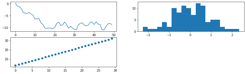
그래프 겹치기 + legend 달기
data = np.random.randn(30).cumsum()

plt.plot(data, 'k--')
plt.plot(data, 'k-', drawstyle='steps-post')
plt.show()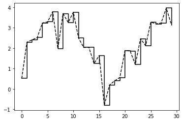
data = np.random.randn(30).cumsum()

plt.plot(data, 'k--', label ='Default')
plt.plot(data, 'k-', drawstyle='steps-post', label = 'steps-post')
plt.legend()
plt.show()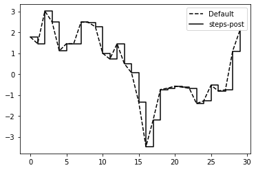
이름 달기
plt.plot(np.random.randn(10000).cumsum())
plt.title('Random Graph')
plt.xlabel('Stages')
plt.ylabel('Values')
plt.show()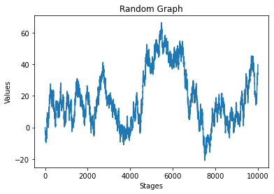
종합
plt.title('Graph')
plt.plot(np.random.randn(1000).cumsum(),
         'k^', label='one')
plt.plot(np.random.randn(1000).cumsum(),
        'b+',label='two')
plt.plot(np.random.randn(1000).cumsum(),
        'r',label='three')
plt.legend()
plt.show()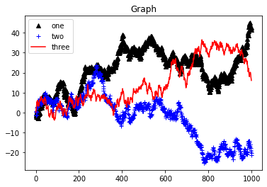
'📌 Python' 카테고리의 다른 글
| Mac - Conda가 안될 때, anaconda 터미널이 안켜질 때 (1) | 2021.06.16 |
|---|---|
| Python - 시각화 기초2 (0) | 2021.01.31 |
| Python - Numpy 기초 (0) | 2021.01.27 |
| Python - Tensor (0) | 2021.01.27 |
| Python - 정규표현식 (3) (0) | 2021.01.24 |